Mega Bus App Concept
As I am a regular commuter from Leicester to Manchester for university I am usually using some kind of mobile travel application to purchase tickets. If you have ever had the misfortune of purchasing tickets on the move using a mobile this can become a difficult process with multiple factors to consider that would not usually occur when booking from home, most importantly time and usability.
As shown by the stats a quarter of all tickets are purchased on the day using a smartphone or tablet, this shows that it is key for any travel service provider to have a fully operational and responsive application in order for its customers to purchase tickets, any company without a functioning application could result in loss of custom.
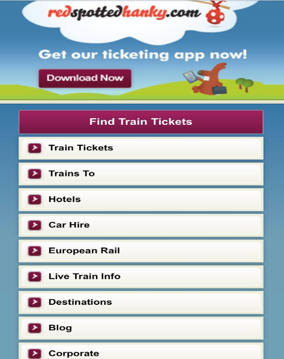
Whilst researching various travel sites evaluating their usability and whether they provide a suitable mobile platform I came across two examples.
In the year 2016-17 the trainline recorded a total passenger usuage of 442.4 million” (gov, 2017)
“The most common time at which tickets are purchased is on the day of travel. Most tickets (60%) are purchased at the station; a quarter are paid for online or via an App on a smartphone or tablet” (Office, 2015)
Elements that can be improved
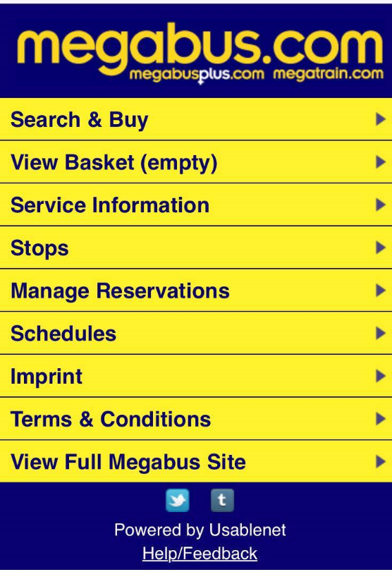
The MegaBus site uses a very basic layout with a bar navigation system allowing quick access to the various menu options this was good for speed of use but is of poor design as there is a lack of information relating to the main service.
Layout is simple but not considered attractive, mobile users could assume that the site is under developed and possibly not in use. Inclusion of a more familiar layout including dropdown menu would leave room for more content including articles.
There is no dedicated help section within the main menu only a statement of how much it would cost to ring the service and the contact number at the footer of the page.
Poor social link layout, small and outdated ( Who uses tumblir?)
Process
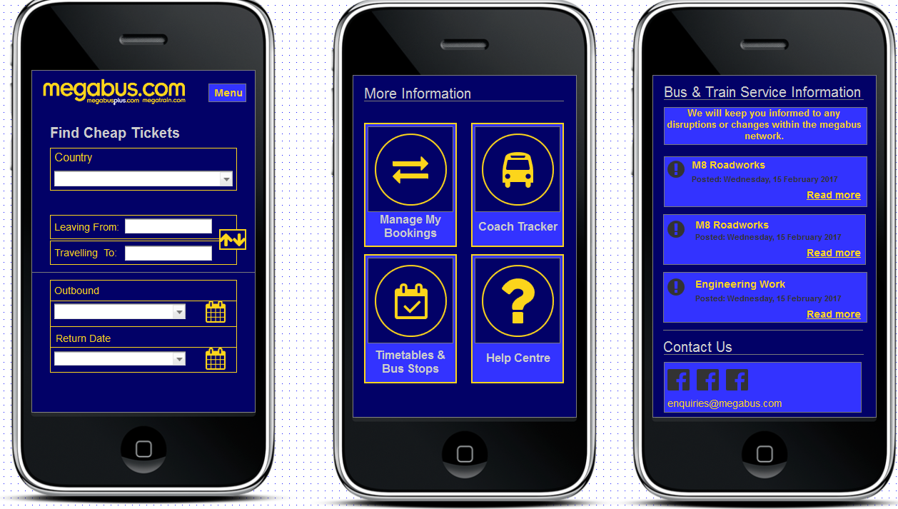
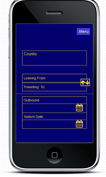
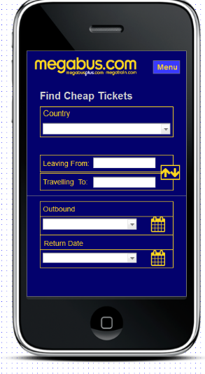
Above is the finished prototype design for the mobile version of the megabus application (see link). I believe this revised version of the application is a vast improvement to what is already in place.
With features including straight to ticket purchase, a clear help section and improved information and social media section displayed, this redesign could be considered an improvement compared to the previous version.
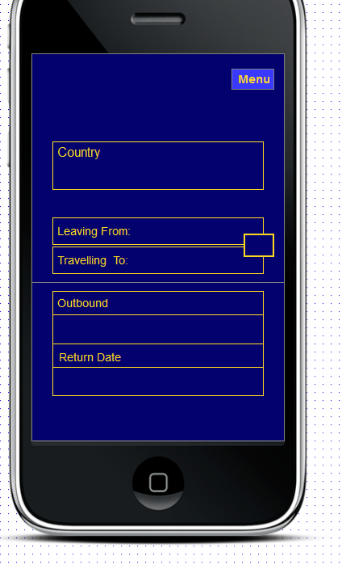
From using axure for this project I have learnt it is a very agile and versatile program with a multitude of options available to designers using it. I hope to use its tool system in more depth in order to create a complete mobile site redesign.
Using Axure
Lorem ipsum dolor sit amet, consectetur adipiscing elit. Ut elit tellus, luctus nec ullamcorper mattis, pulvinar dapibus leo.

This is the heading
Click edit button to change this text. Lorem ipsum dolor sit amet, consectetur adipiscing elit. Ut elit tellus, luctus nec ullamcorper mattis, pulvinar dapibus leo.

This is the heading
Click edit button to change this text. Lorem ipsum dolor sit amet, consectetur adipiscing elit. Ut elit tellus, luctus nec ullamcorper mattis, pulvinar dapibus leo.

This is the heading
Click edit button to change this text. Lorem ipsum dolor sit amet, consectetur adipiscing elit. Ut elit tellus, luctus nec ullamcorper mattis, pulvinar dapibus leo.

© 2025 Fazhie